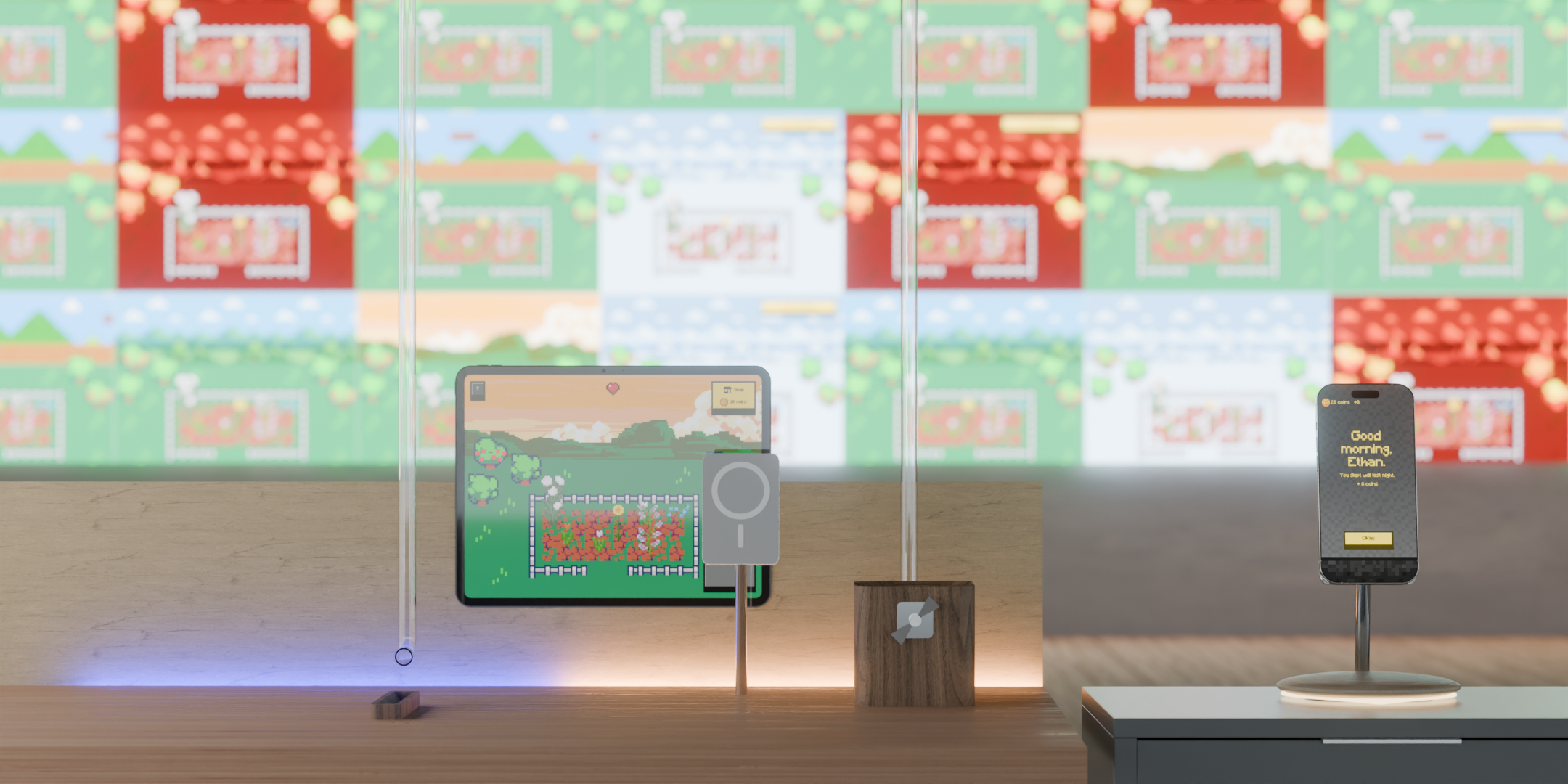

Our initial research aimed to solve "patient boredom." However, through triangulation (online ethnography, surveys, interviews, and focus groups), we uncovered a deeper, systemic issue.
1
The "Nod and Agree" Phenomenon: Patients frequently accept treatment without fully understanding it. They stay silent to avoid being a "burden" to busy nurses, leading to anxiety and false consent.
2
Boredom is a Symptom, Not the Cause: What appeared to be boredom was actually a lack of awareness. Patients felt they were waiting in a void, leading to mental and physical deconditioning.
3
Autonomy Equals Trust: When patients lack control over their environment or care decisions, their trust in the healthcare system erodes, slowing recovery.
We reframed the problem space from curing boredom to closing the communication gap.
The Problem
Patients often feel powerless due to a lack of clear, continuous information. When communication is limited, patients become passive participants in their own care. This heightens anxiety, dependence, and feelings of neglect.
The Problem
How might we...
Provide patients with clear, timely information so they feel informed rather than anxious during waiting periods?
Ensure patients truly understand treatments before consenting?
Give patients meaningful tools to participate in their care?
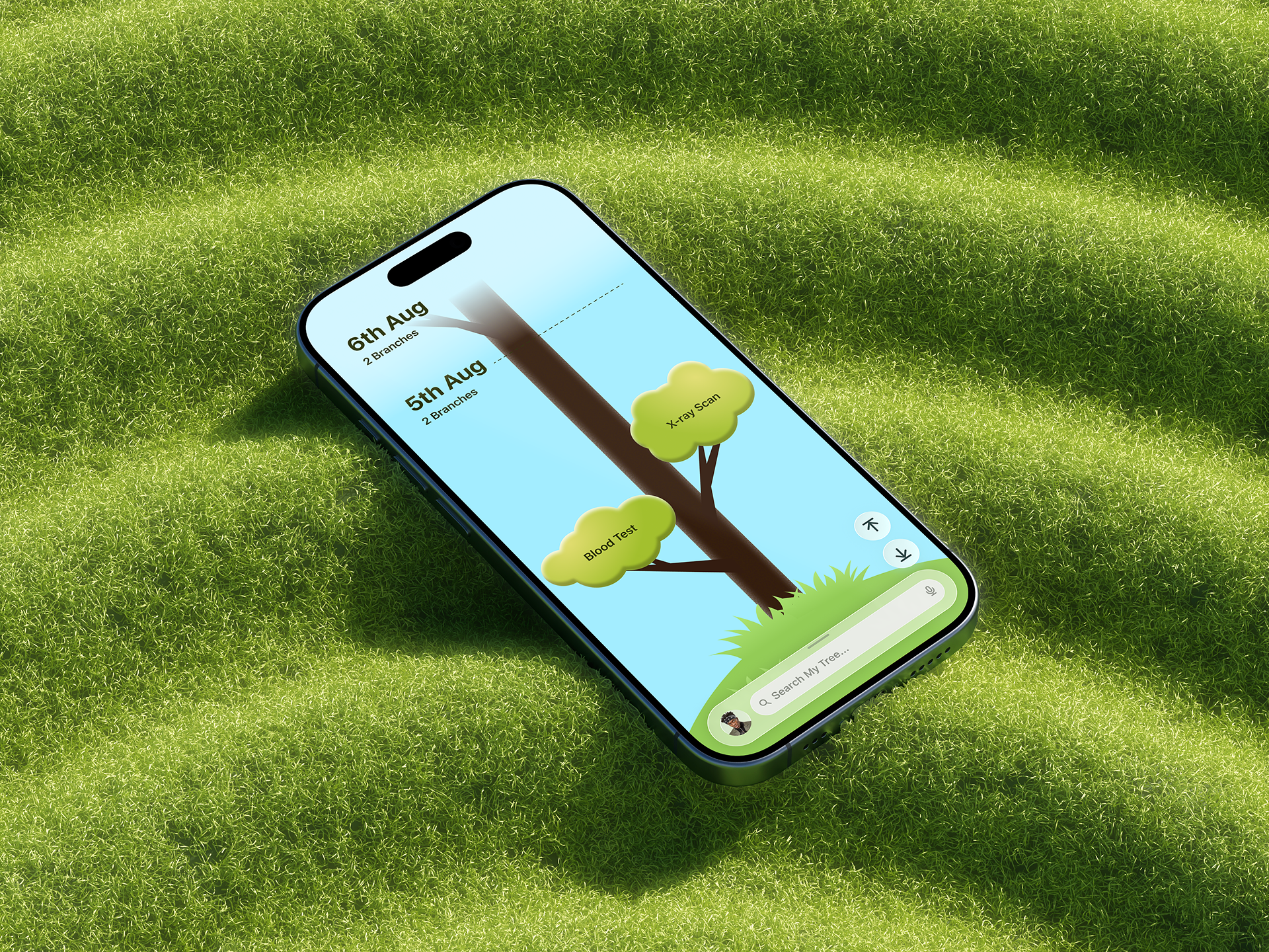
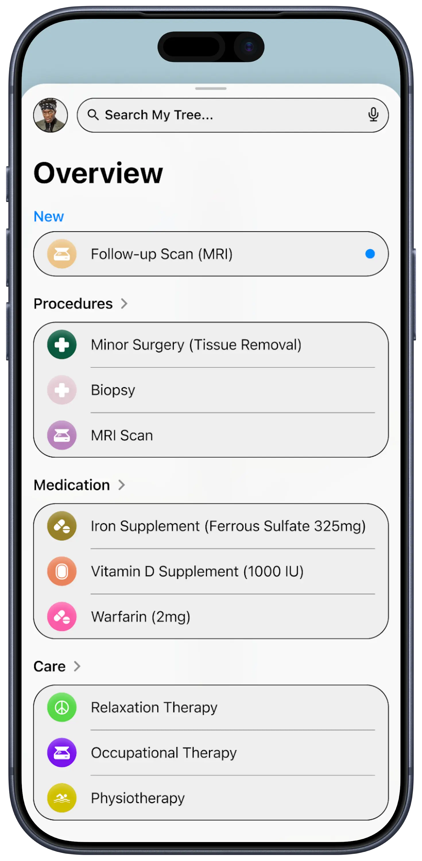
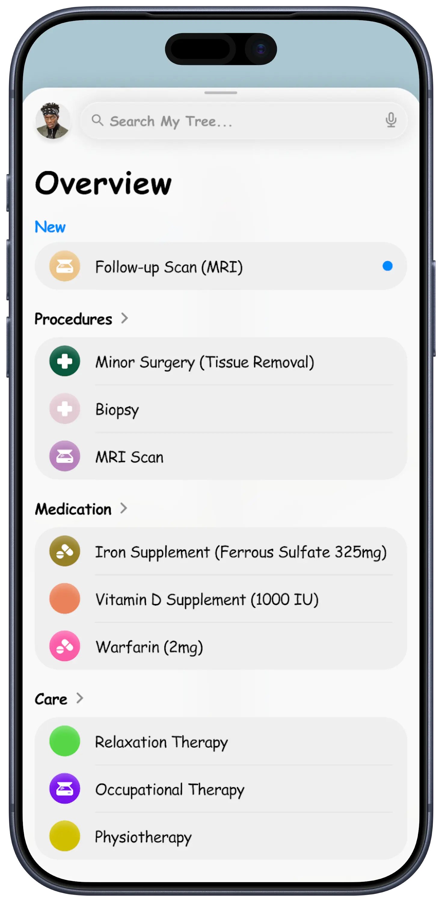
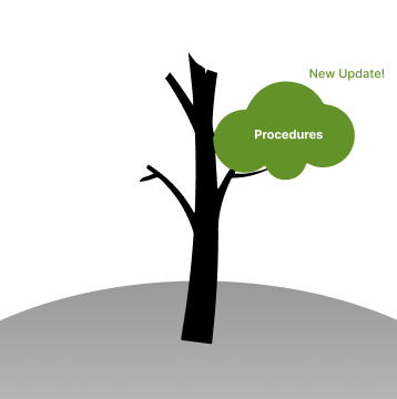
Your Tree
A timeline that grows upward throughout your hospital journey, helping you as a patient to focus on what matters most: your progress.
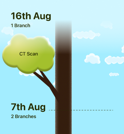
Branches
Each branch has an overview, important facts and what to expect.
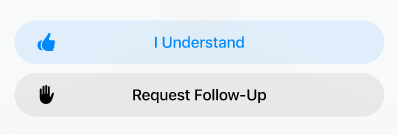
You can acknowledge understanding of information or request follow up.
Follow Up
Request for a nurse check-in with you.
Progress tracking, giving live updates in app while you wait.
Understood
A personal record for the future you.
It helps save on your time and your doctor’s time.
A timestamp is saved for your own record-keeping.
TV Collaboration
Nurses can cast information to the in-room TV, annotate it live during discussions, and sync those notes back to the patient’s phone for later review.
Annotations
Nurses can connect to patient TVs to highlight, annotate, and explain information live.
These annotations sync automatically between TV and mobile app. Patients enjoy the freedom to access these notes from their mobile device at any time.
Accessibility
We built for accessibility throughout the entire duration of the product’s development lifecycle.
High Contrast
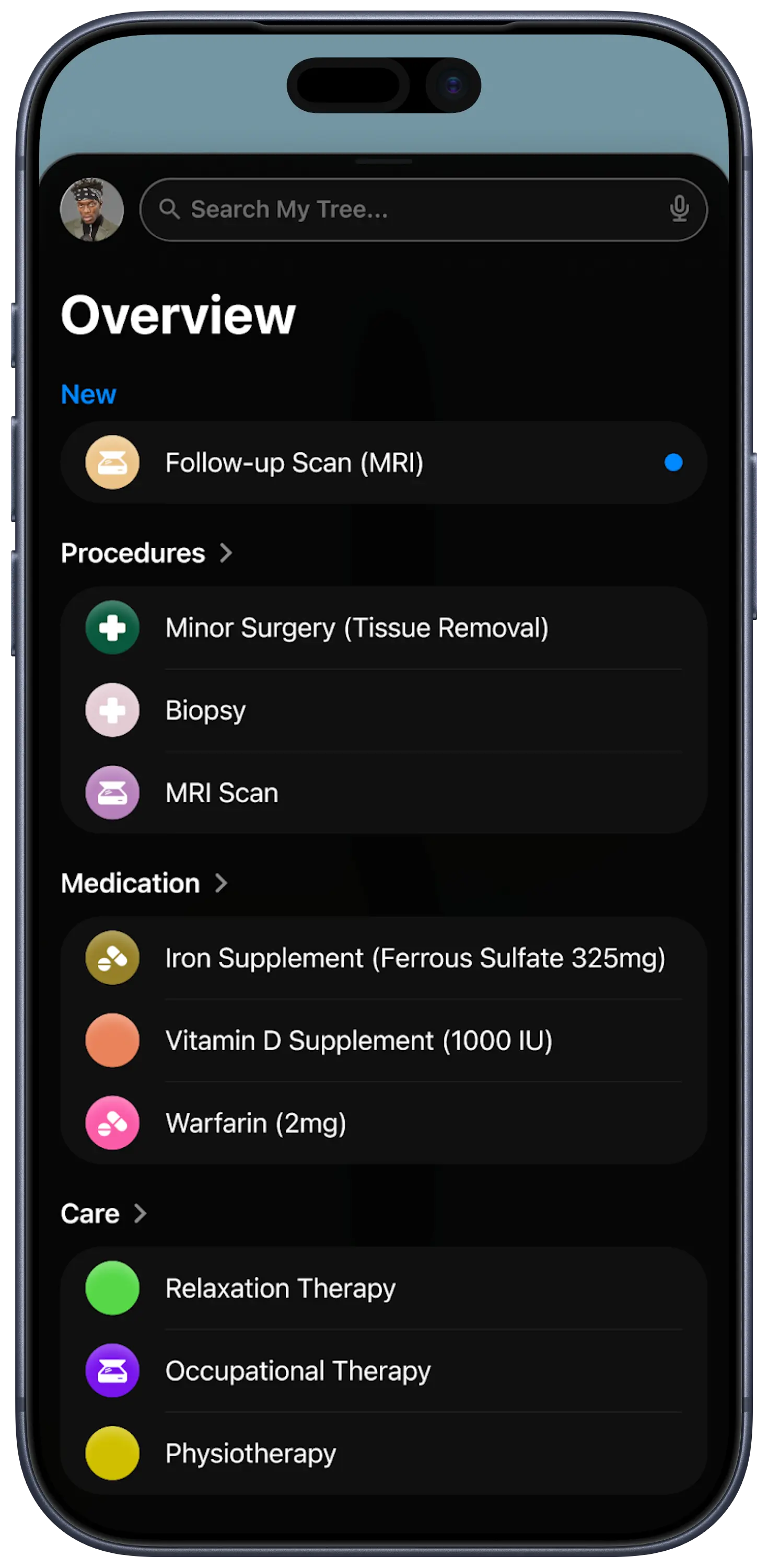
Dark Mode
Dyslexia Mode
Language Support
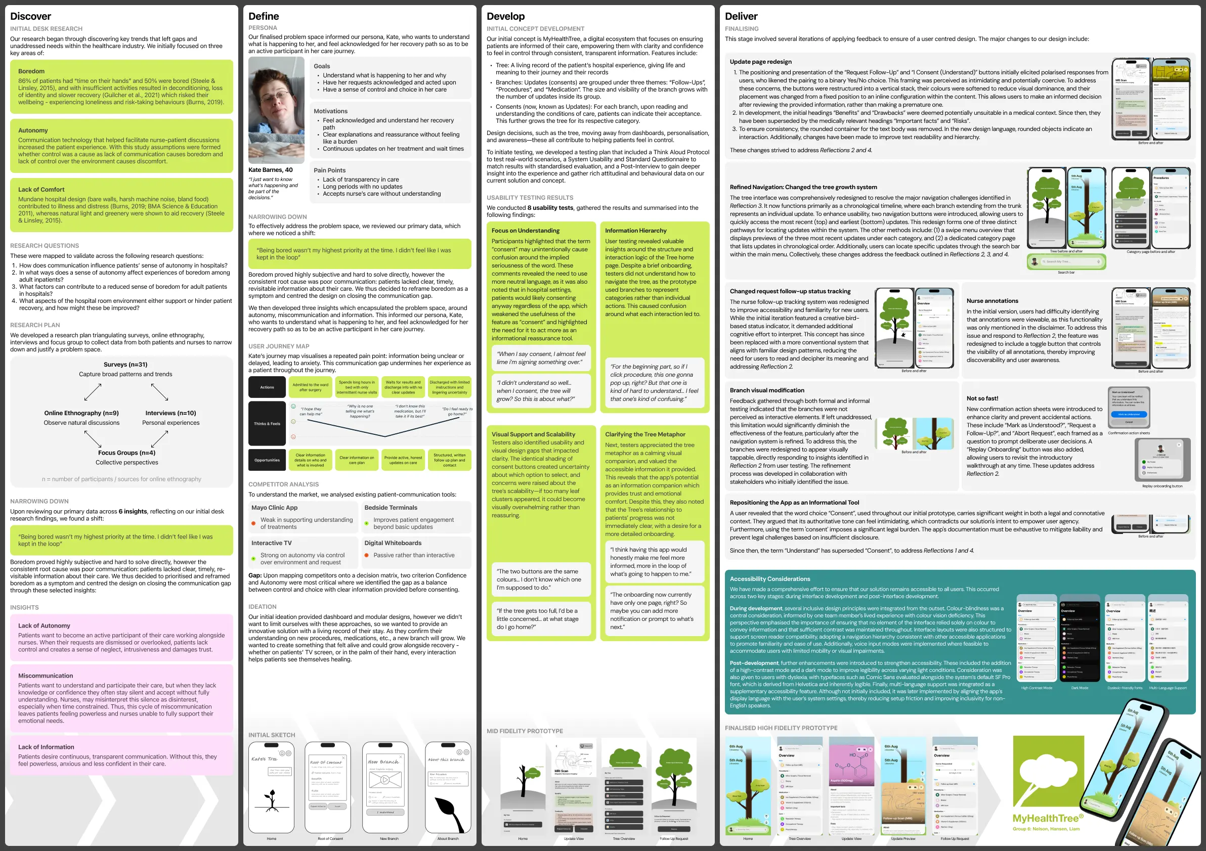
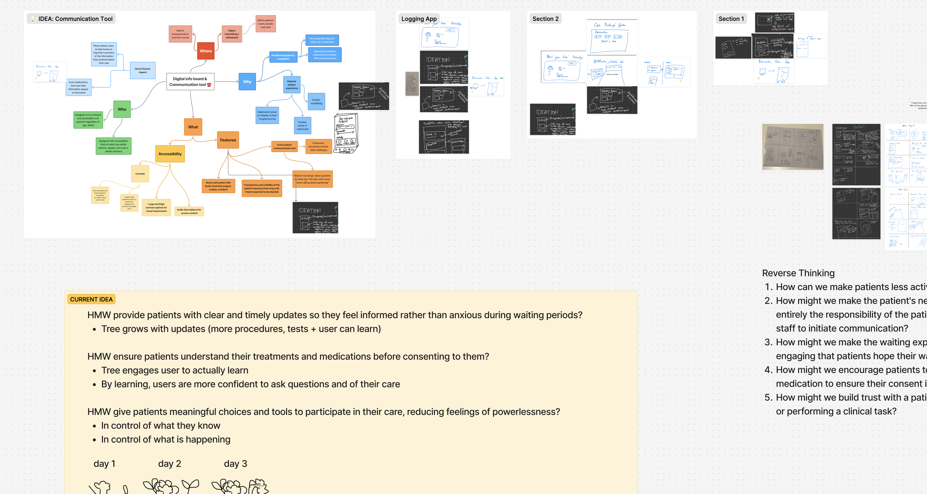
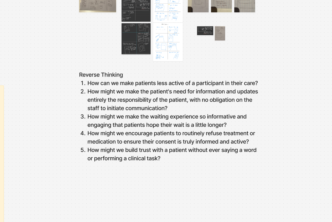
Using Reverse Thinking
We explored how to encourage patients to pause and question their care rather than blindly accepting it. We landed on the tree idea based on research indicating positive patient outcomes, and the opportunity for it to symbolise growth and stability.
Iteration & Usability Testing
We conducted multiple rounds of testing, resulting in critical refinements to UX writing and hierarchy.
Challenge 1
The Legal Barrier
Issue
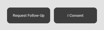
Users found the term "Consent" intimidating and legalistic. It felt like signing a contract rather than receiving care.
Fix
We changed the microcopy to "I Understand." This shifted the mental model from liability to comprehension, encouraging patients to admit when they don't understand.
Challenge 2
Information Overload
Issue

Consent forms were dense blocks of text.
Fix
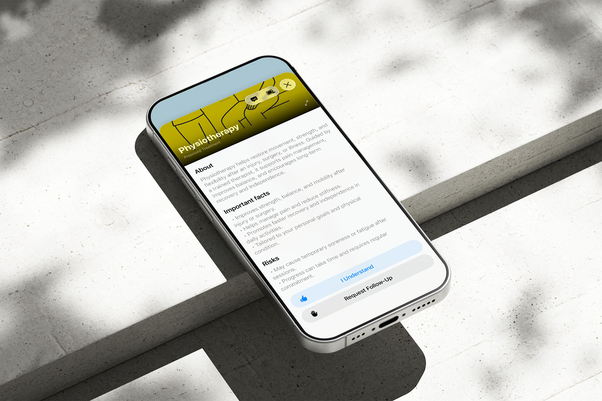
We introduced a strict visual hierarchy, breaking content into clear sections labelled "Important Facts," "Risks," and "Benefits" to improve scannability.
Challenge 3
Abstract Growth
Issue
Users found an empty tree "sad" or a full tree "overwhelming."
Fix
We refined the onboarding to explicitly frame the tree as a "living record," where growth equals progress in recovery, turning the visual into a positive reinforcement loop.
Challenge 4
Confusing Navigation
Issue
Patients under cognitive stress found traditional, multi-page navigation disorienting, easily losing their place within the app.
Fix
We transitioned to a continuous, single-page scroll. The tree acts as a central timeline, utilising a swipe-up menu for details to prevent jarring context switches and keep users grounded.
The Impact
MyHealthTree transforms the hospital experience from a passive wait into an active journey.
Key Outcomes
1
Patients
Patients frequently accept treatment without fully understanding it. They stay silent to avoid being a "burden" to busy nurses, leading to anxiety and false consent.
2
Nurses
What appeared to be boredom was actually a lack of awareness. Patients felt they were waiting in a void, leading to mental and physical deconditioning.
3
Hospitals
When patients lack control over their environment or care decisions, their trust in the healthcare system erodes, slowing recovery.